Animating Hotwire Powered Modals with Stimulus and Tailwind
The Setup
It’s now super easy to get Modal dialogues up and running in your Rails app, thanks to Hotwire and Turbo Streams.
The following general technique I just leared from Pete Hawkins over at https://rapidruby.com/. He’s making great new Rails content over there, and I try to support any new content makers focussing on modern Rails. I highly recommend you check him out.
Pete’s initial solution did not handle the animation of the modal. It simply immediately appeared, and immediately disappeared on dismisal.
If you know me, you know I need to have that little bit of polish where it feels like an interaction has happened. I think it’s better for my users. So I set out to figure out how to animate this modal in, and out.
As you’ll see, because we are going to be dismissing the modal by changing the modal’s turbo frame source, that means the contents of the frame will immediately be replaced with new content - there will be no chance to animate anything.
So my initial plan of attack revolved around the idea of using a Stimulus controller to hook onto the Modal’s DOM element, target both the backdrop and the dialog parts, override the dismissal link’s default action, do some CSS jiggery pokery to animate stuff, then make the modal’s turbo frame update when I am ready, and when the modal has animated out of view. In list form:
- Stimulus controller takes control of the Modal’s DOM element.
- It should target both the backdrop (so we can animate that) and the dialog.
- When the controller connects, we can easily add the animation classes then.
- We will need to hook into the dismissal link and prevent it from causing the modal’s turbo frame from updating its src (until we are ready).
Getting the basic Modal setup
First, you need to add a turbo_frame_tag into your application layout that will
be for any modals you want to appear.
# app/views/layouts/application.html.erb

<!DOCTYPE html>
<html lang="en" class="h-screen">
  <head>
    <%= render "layouts/partials/head" %>
  </head>

  <body class="antialiased">
    <%= render "shared/flash_alerts" %>
    <%= yield %>

    <!-- Add this turbo frame -->
    <%= turbo_frame_tag :modal %>
  </body>
</html>
Next, you’ll want a button to open that modal. This is what appears in my ‘Projects’ dashboard:
# app/views/projects/index.html.erb

<!-- the data tag targets the modal turbo frame when the link is clicked -->
<!-- the link path causes the modal frame to load the new project modal into it -->
<%= link_to new_project_path, data: { turbo_frame: :modal }, class: "inline-flex items-center rounded-md bg-indigo-600 px-3.5 py-2.5 text-sm font-semibold text-white shadow-sm hover:bg-indigo-500 focus-visible:outline focus-visible:outline-2 focus-visible:outline-offset-2 focus-visible:outline-indigo-600" do %>
    <svg class="-ml-0.5 mr-1.5 h-5 w-5" viewBox="0 0 20 20" fill="currentColor" aria-hidden="true">
      <path d="M10.75 4.75a.75.75 0 00-1.5 0v4.5h-4.5a.75.75 0 000 1.5h4.5v4.5a.75.75 0 001.5 0v-4.5h4.5a.75.75 0 000-1.5h-4.5v-4.5z" />
    </svg>
    New Project
<% end %>
It targets the :modal turbo frame you added to the application layout. Next,
we need to prepare the content that needs to be loaded into the modal to also
be wrapped in a turbo_frame_tag that targets :modal. I’m using view_components,
but you can ignore that, it’s just a detail and isn’t specific to this method of
implementing modals in your application:
# app/views/prooject/new.html.erb

<%= turbo_frame_tag :modal do %>
  <%= render(ModalComponent.new) do %>
    <div class="mt-4">
      <h3 class="text-2xl font-bold mt-4">Create a new Project</h3>
      <p class="text-sm leading-tight mt-2 mb-4 text-gray-700">Creating a new project allows you to create surveys for a particular website.<p>

      <%= render partial: 'form', locals: {project: @project} %>
    </div>
  <% end %>
<% end %>
Here’s the ERB fragment the component above renders anyway (I’m just using a stock TailwindUI fragment for the modal skeleton, because ain’t nobody got time to reinvent every wheel):
<div class="relative z-10" aria-labelledby="modal-title" role="dialog" aria-modal="true">
  <div class="fixed pointer-events-auto inset-0 bg-gray-500 bg-opacity-75 transition-opacity"></div>

  <div class="fixed inset-0 z-10 overflow-y-auto">
    <div class="flex min-h-full items-end justify-center p-4 text-center sm:items-center sm:p-0">
      <div class="relative transform overflow-hidden rounded-lg bg-white px-4 pb-4 pt-5 text-left shadow-xl transition-all">

        <%= link_to close_modal_path, data: {turbo_frame: :modal}, class: "absolute top-3 right-3" do%>
          <svg xmlns="http://www.w3.org/2000/svg" viewBox="0 0 24 24" fill="currentColor" class="w-6 h-6">
            <path fill-rule="evenodd" d="M5.47 5.47a.75.75 0 011.06 0L12 10.94l5.47-5.47a.75.75 0 111.06 1.06L13.06 12l5.47 5.47a.75.75 0 11-1.06 1.06L12 13.06l-5.47 5.47a.75.75 0 01-1.06-1.06L10.94 12 5.47 6.53a.75.75 0 010-1.06z" clip-rule="evenodd" />
          </svg>
        <% end %>

        <%= content %>
      </div>
    </div>
  </div>
</div>
So with that, you now have a modal dialog that pops up and goes away when it should. Literally no additional Javascript was required to get this to happen, and this is the full power of Hotwire in effect.
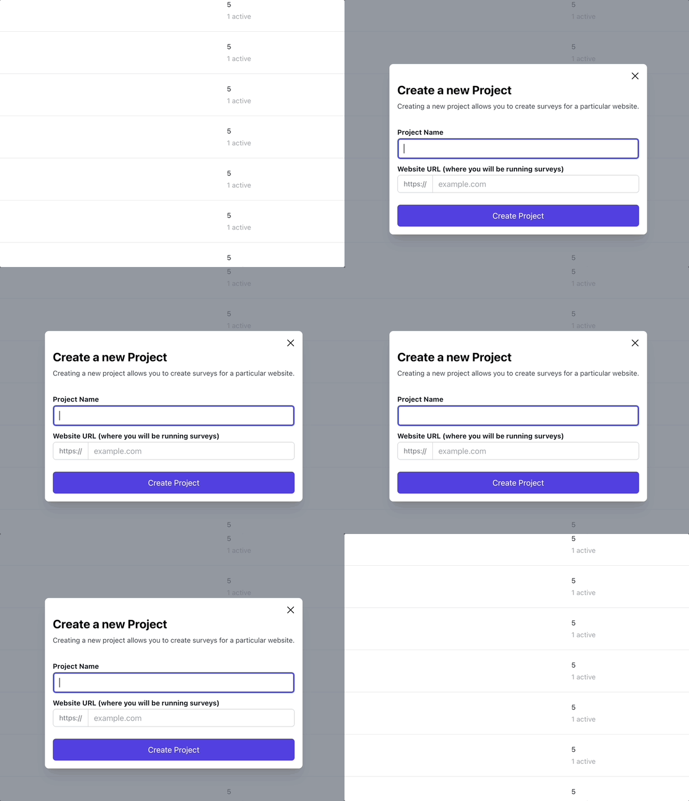
But as you’ll see from this gif, the backdrop and modal both just snap in and snap out of existence:

We can do better…
Adding a sprinkling of Javascript to make the magic happen
First, let’s touch up our modal dialog’s HTML so that it will work with the Stimulus controller we will create:
<div class="relative z-10" aria-labelledby="modal-title" role="dialog" aria-modal="true" data-controller="modal" >
  <div class="fixed pointer-events-auto inset-0 bg-gray-500 bg-opacity-75 transition-opacity opacity-0"
    data-modal-target="backdrop"
    data-entering-classes="ease-out duration-300 opacity-100"
    data-leaving-classes="ease-in duration-200 opacity-0"
    data-action="modal#close"
    ></div>

  <div class="fixed inset-0 z-10 overflow-y-auto">
    <div class="flex min-h-full items-end justify-center p-4 text-center sm:items-center sm:p-0">
      <div
        data-modal-target="dialog"
        data-entering-classes="ease-out duration-300 opacity-100 !translate-y-0"
        data-leaving-classes="ease-in duration-200 opacity-0 !translate-y-4 !sm:translate-y-0"
        class="relative transform overflow-hidden rounded-lg bg-white px-4 pb-4 pt-5 text-left shadow-xl transition-all opacity-0 translate-y-4">

        <!-- We will hook into this link in the stimulus controller to prevent it's default action -->
        <%= link_to close_modal_path, data: {turbo_frame: :modal, modal_target: "dismiss", action: "click->modal#close keydown.esc@document->modal#close"}, class: "absolute top-3 right-3" do%>
          <svg xmlns="http://www.w3.org/2000/svg" viewBox="0 0 24 24" fill="currentColor" class="w-6 h-6">
            <path fill-rule="evenodd" d="M5.47 5.47a.75.75 0 011.06 0L12 10.94l5.47-5.47a.75.75 0 111.06 1.06L13.06 12l5.47 5.47a.75.75 0 11-1.06 1.06L12 13.06l-5.47 5.47a.75.75 0 01-1.06-1.06L10.94 12 5.47 6.53a.75.75 0 010-1.06z" clip-rule="evenodd" />
          </svg>
        <% end %>

        <%= content %>
      </div>
    </div>
  </div>
</div>
You can check out the above code fragment, but I just configured it so that the Stimulus controller we’re about to create will attach to it, one target for the backdrop, one target for the dialog, and data attributes for entering and leaving css classes for both. The close modal link got some extra data attribures also got a target and an action when it is clicked. That’s it.
Now, on to creating the Stimulus controller that will do our bidding and interrupt the flow of clicking on the close link to dismiss the modal, and let us do our animation shenanigans:
import { Controller } from '@hotwired/stimulus'

export default class extends Controller {
  static targets = ["backdrop", "dialog", "dismiss"]

  connect() {
    console.log("Modal controller connected")
    this.backdropEnteringClass = this.backdropTarget.dataset.enteringClasses || "";
    this.backdropLeavingClass = this.backdropTarget.dataset.leavingClasses || "";

    this.dialogEnteringClass = this.dialogTarget.dataset.enteringClasses || "";
    this.dialogLeavingClass = this.dialogTarget.dataset.leavingClasses || "";

    // Use an animation frame to remove the backdrop leaving classes that might be there
    // and add the backdrop entering classes.
    requestAnimationFrame(() => {
      this.backdropTarget.classList.remove(...this.backdropLeavingClass.split(" "))
      this.backdropTarget.classList.add(...this.backdropEnteringClass.split(" "))
    })

    // Use an animation frame to remove any dialog leaving classes that might be there
    // and add the dialog entering classes.
    requestAnimationFrame(() => {
      this.dialogTarget.classList.remove(...this.dialogLeavingClass.split(" "))
      this.dialogTarget.classList.add(...this.dialogEnteringClass.split(" "))
    })
  }

  close(e) {
    // We must stop the link from doing it's think and changing the modal's turbo frame source
    e.preventDefault();
    const abortListener = new AbortController();

    requestAnimationFrame(() => {
      this.backdropTarget.classList.remove(...this.backdropEnteringClass.split(" "))
      this.backdropTarget.classList.add(...this.backdropLeavingClass.split(" "))
    })

    this.dialogTarget.addEventListener("transitionend", () => {
      // Remove this event listener because otherwise multiple transitions will
      // cause this function to be called N times, and will generate a console
      // error about the user aborting a request due to the modelEl.src being
      // set multiple times. Listening for one `transitionend` is fine, because
      // they all have a single duration anyway.
      abortListener.abort()

      // Manually we take the close link's href and set the modal turbo frame's
      // src to that path (in this case the /close_modal path), which will clear
      // the modal from the screen, magically, thanks to Turbo Frames.
      const href = this.dismissTarget.href
      const modalEl = document.querySelector("#modal")
      modalEl.src = href
    }, { signal: abortListener.signal });

    requestAnimationFrame(() => {
      this.dialogTarget.classList.remove(...this.dialogEnteringClass.split(" "))
      this.dialogTarget.classList.add(...this.dialogLeavingClass.split(" "))
    })
  }
}
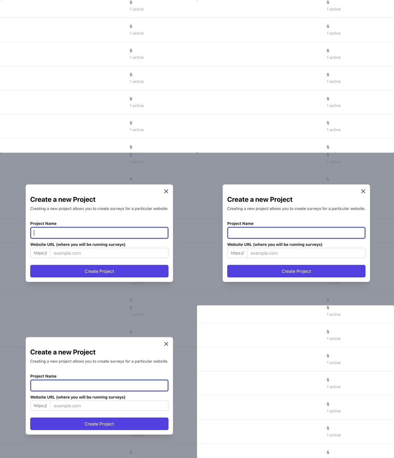
And here’s how that looks:

Smashed it!
I was pretty amazed that my pseudo code outline plan of attack basically translated directly into Javascript, and it almost worked exactly from the outset.
The cool part where I wait for the transitionend came at the end of development
when I realized that the modal source was being updated before the transition
could complete, so it had this jarring snapping out effect as the contents were
replaced mid-transition.
But by waiting for the transitionend event, you can be guaranteed that the
transition you care about has ended. So no need to use setInterval or any other
kind of hacks. And if I decided to change the duration in the future, this code
will still just work™.
Conclusion
That’s it! The only thing missing right now is clicking on the modal backdrop does not dismiss it. This is due to some shenanigans with the way Tailwind is used to create this modal. I’ll get to it…
Thanks again to Pete at https://rapidruby.com/ for showing the way. 🙇